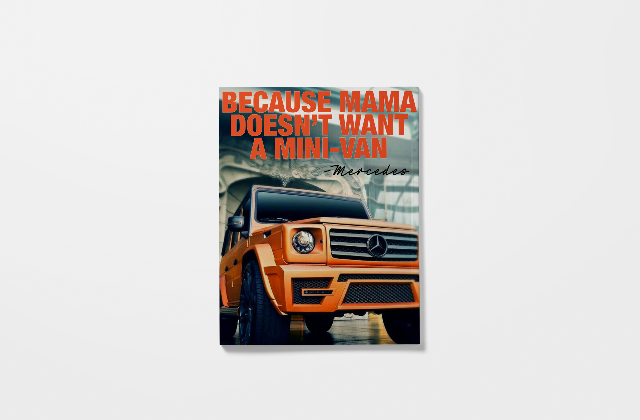
Betty Magazine
typography 2
assignment: design a magazine of your interest. must have: a cover, contents page, 2 pages of feature story, and at least 2 other content pages.
my vision: a magazine for the modern mom- but the other kind of modern mom, not the “pinterest perfect” moms. the moms that are breaking the mold, changing the idea of what a mom is supposed to be. the moms that are unapologetic-ally doing it their way.
the idea was to throw a jab at the old 50’s housewife mom, by photoshopping an old ad and spray painting over her face. The name for the magazine, betty, came from the idea that it was a common 50’s name.
all the headlines and written content were concepts i came up with to show the provocativeness of the magazine. if this magazine was real it would show and support mothers that doing an amazing job but are anything but what society expects them to be.
the images used in this magazine are images found online- except for the photographs of the main feature, i shot those photos of my sister and my nieces.
i used abril fatface serif typeface because it’s so bold and elegant- just how i imagine my readers to be.
i have to admit this was one of my favorite design projects!


*some of the images used are not my own and this design is solely for portfolio // school work use

