Fiesta De La Flor Branding Project
Project: festival re-branding
Lesley University
Viscom II
Professor Mark James
Each student will choose a festival event that happens somewhere during the year in the US. You can also choose something interesting outside of the US, makes sure that there’s enough language support for the research you’ll need to accomplish. This will be the basis for your identity development and related brand components throughout the course. Festivals should be something that you have some passion for so that you can explore material deeply over the semester.
My choice was the Fiesta de la Flor festival, which takes place yearly in Corpus, Christi TX.
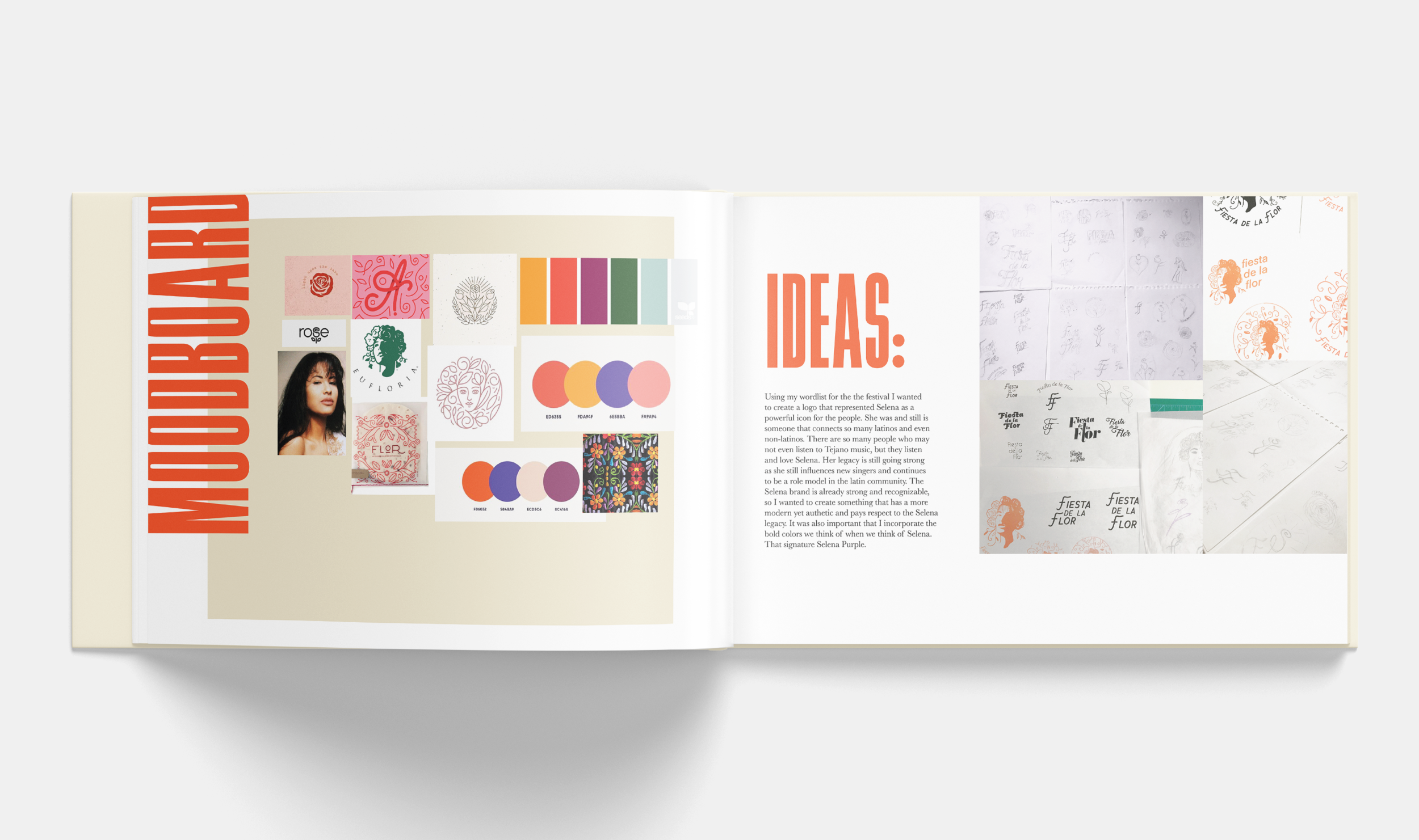
Ideas:
Using my wordlist for the festival I wanted to create a logo that represented Selena as a powerful icon for the people. She was and still is someone that connects so many Latinos and even non-Latinos. There are so many people who may not even listen to Tejano music, but they listen and love Selena. Her legacy is still going strong as she still influences new singers and continues to be a role model in the Latin community. The Selena brand is already strong and recognizable, so I wanted to create something that has more modern yet authentic and pays respect to the Selena legacy. It was also important that I incorporate the bold colors we think of when we think of Selena. That signature Selena Purple.
The final logo represents Selena as an unforgettable icon. The vines around her head represent the legacy she continues to grow and the people she has connected with. The design of the vines was inspired by traditional Mexican textiles. The floral crown is fitting for a Queen and represents the Mexican day of the dead floral crown. The logo is circular so that it represents the community. Her face silhouette establishes her presence and feels powerful- because that’s what Selena was.
posters
t-shirts:
tickets & Merch
guerrilla marketing
The idea behind the door:
The door symbolizes the doors Selena opened for other Latinos, especially women, with her career. One of her many famous songs is called “El Chico Del Apartamento 512” which means the boy from apartment # 512. The idea for guerrilla marketing is to have these “Selena doors” placed in random areas promoting the festival.
Motion Graphic:
The motion graphic for this event was meant to give the feeling that Selena is still here, she is everywhere we look, and she lives on through her fans. I wanted to highlight her fans in the motion graphic, show the Selena culture. I did this by showing images of Selena murals, fans with Selena tees and costumes, little girl fans who weren’t even born when Selena was alive. Proving that her legacy will live on. At the end of the motion graphic, we see how the logo was created by showing Selena’s photo that inspired the design.
visual language in the motion graphic:
The type in the motion graphic was inspired by a letterpress poster. I really wanted to incorporate the beauty of letterpress into this project. The typeface really felt like it tied well with the brand identity because it wasn’t too modern, yet didn’t feel too old. I treated the type to give it some of that sophisticated letterpress grit. I also applied the same treatment to the logo to give it a feeling of a stamp.
Storyboard:
my process book for this project:
conclusion:
This project was more than a student assignment for me, it quickly became a passion project. I grew up loving Selena, I still love Selena. She was the first role model that I had that looked like me and was someone who showed kindness to everyone. Selena is an icon because she united & continues to unite Latinos in a positive way. Even though her life was cut too short, she accomplished more than she ever knew. It’s amazing that 25 years after her death we are still celebrating her legacy, teaching our young ones how to Selena cumbia.
So when I decided to take on this project I began to feel pressure to get it right, because her legacy and brand is so strong. I really wanted to create something that not only I could be proud of, but that paid respect and homage to her, her family, & fans. At first, I struggled coming up with the logo, I tried so many different sketches. Once I got that done & the poster everything really started to flow easily. I’m super proud of this project & I hope if it ever falls into the eyes of other fans & her family they will be too!


